
A paint chip can look quiet at the store and surprisingly pink once you hold it beside a stack of white cardstock. In a craft room, that shift matters. The walls sit behind fabric, thread, paint, and all the little things you need to compare under your work light.
The best craft room paint colors depend on what you want the walls to do. A quiet backdrop gives you room to spread out colorful supplies. A deeper color can pull open shelving together, and a painted shape can give a worktable its own spot in a shared room. The ideas below cover both the color and where to put it.
1. Warm White Walls for Color Matching
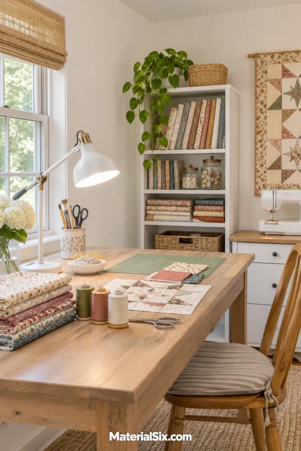
Try a gently warmed white if your projects involve comparing thread, paper, or fabric. Hold your sample beside a sheet of white cardstock. If the wall sample suddenly looks creamy and you’d prefer a quieter backdrop, try a white with less yellow.
Keep a white or neutral mat at the point where you make color decisions. You can bring a swatch over to that surface when the rest of the room is full of colorful supplies.
2. Oatmeal Beige for a Cozy Sewing Room
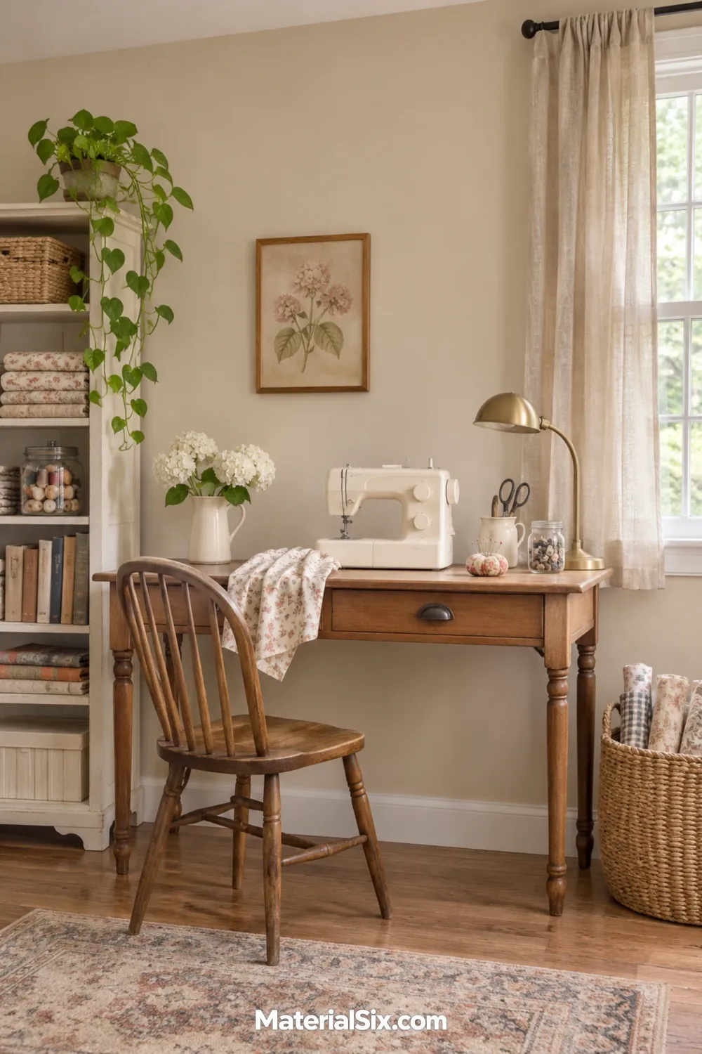
Oatmeal beige works with old wood furniture, flax curtains, and woven baskets. In a sewing room, it can tie together a hand-me-down desk and a newer sewing machine without sending you shopping for matching furniture. Hold the swatch next to the wood first. If both read strongly golden, look for an oatmeal with a little more gray.
3. Pale Sage for an Organized Craft Wall
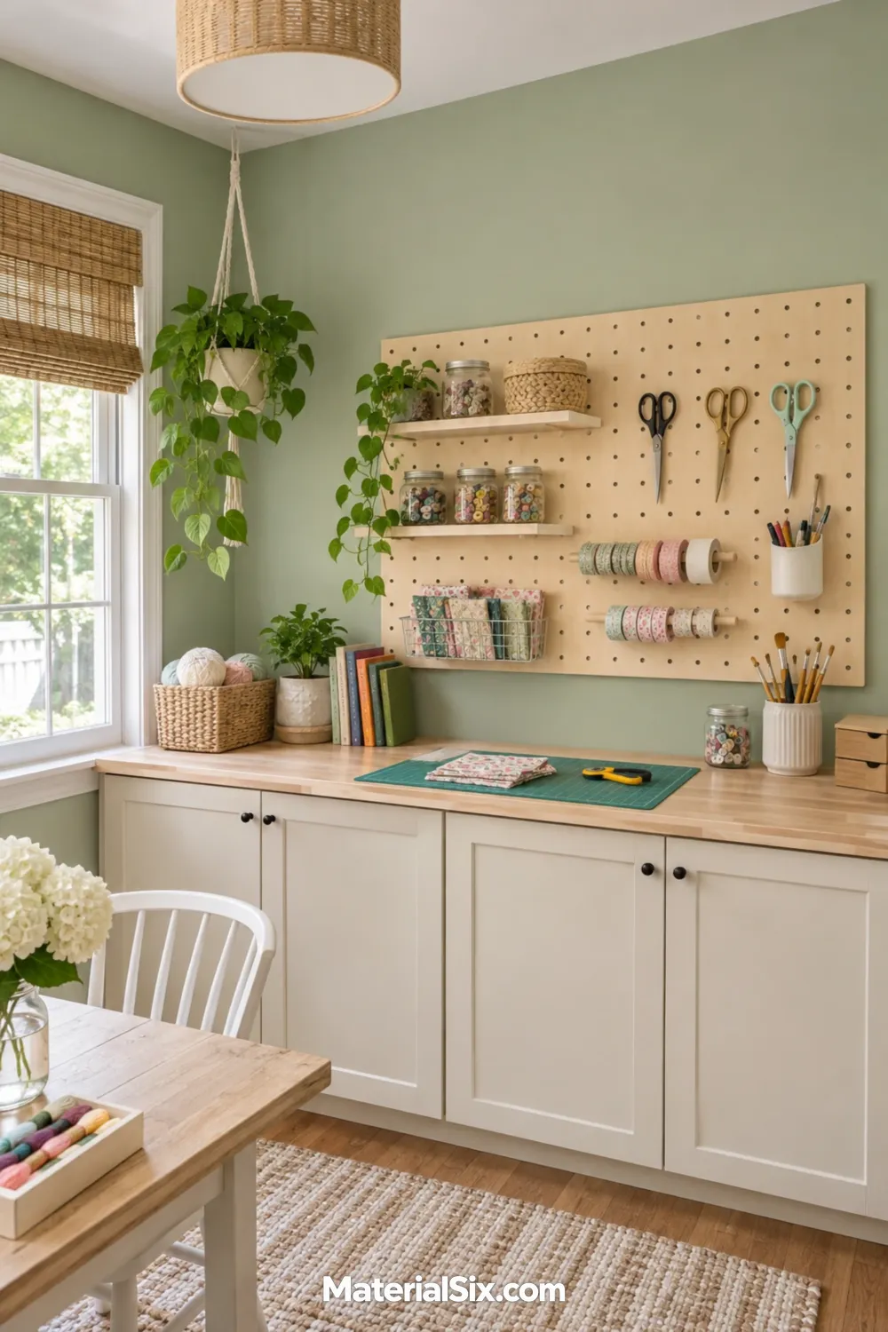
Paint the wall pale sage and leave the pegboard in natural birch. The contrast gives the tool area a clear outline, even when the hooks are empty. Carry the light wood down to the work surface or add cream drawers below for supplies you prefer to tuck away.
4. Powder Blue for a Small Craft Corner
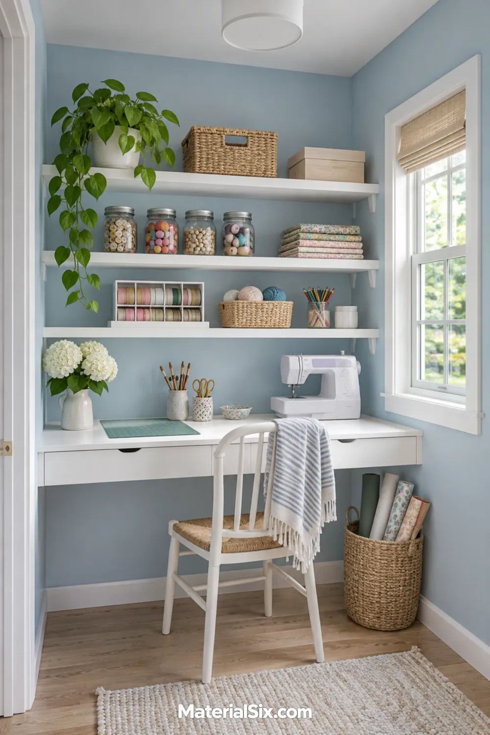
Let powder blue wrap the back and sides of an alcove so the craft corner looks like a single workspace. White shelves and a slim white desktop give the blue some breathing room. Swatch one sidewall as well as the back. Light from the next room can make the two surfaces look surprisingly different.
5. Butter Yellow to Warm Up a Dim Room
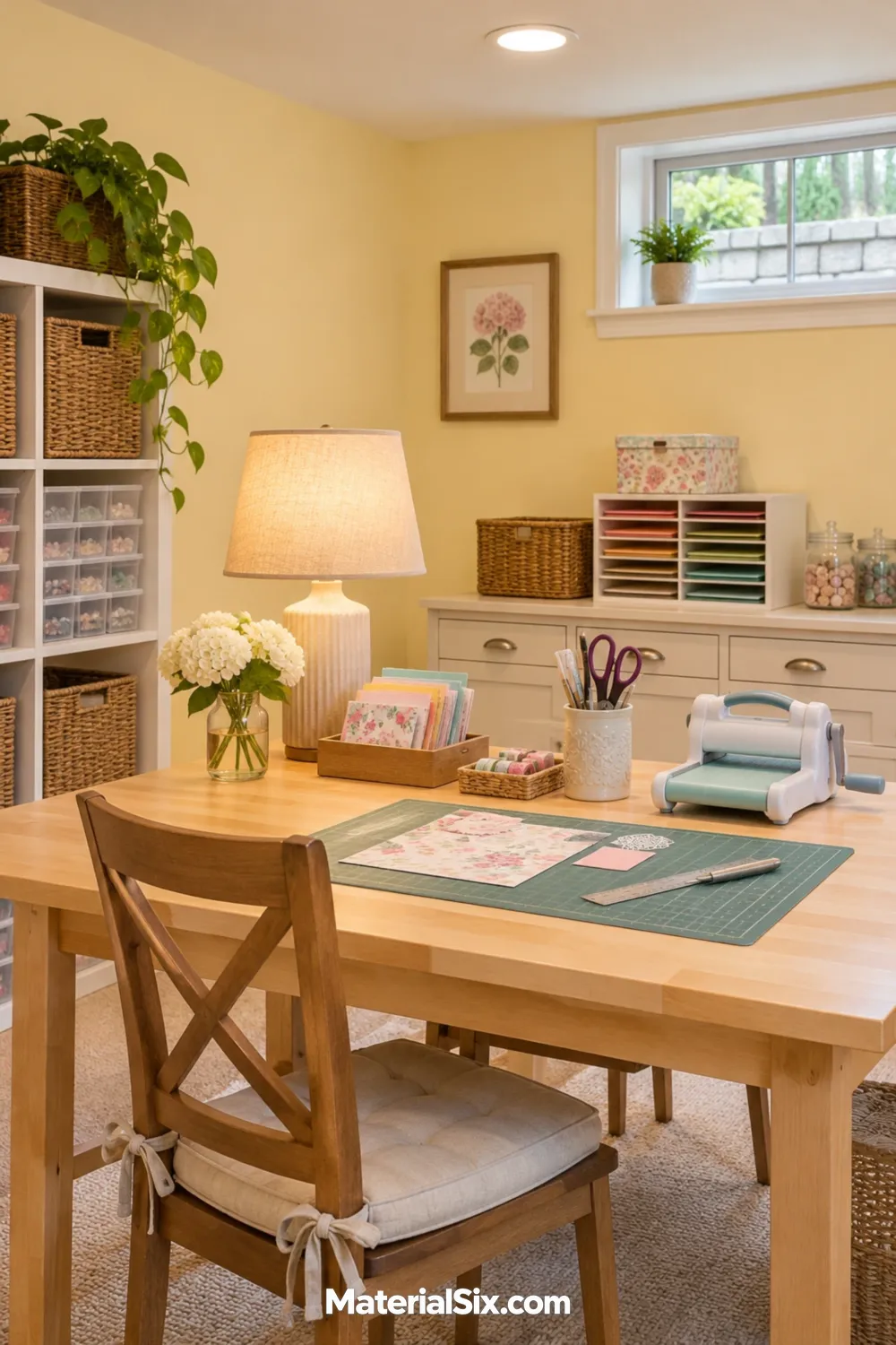
In a basement craft space with a small window, soft butter yellow brings warmth to the area you see from the stairs. Test it with your actual task lamp switched on. A yellow that seems gentle in daylight may feel stronger under a warm bulb.
If you enjoy the color from across the room but find it distracting near your projects, keep the yellow on the wall across from your seat and leave the wall behind the table a quiet neutral.
6. Dusty Pink With Natural Wood
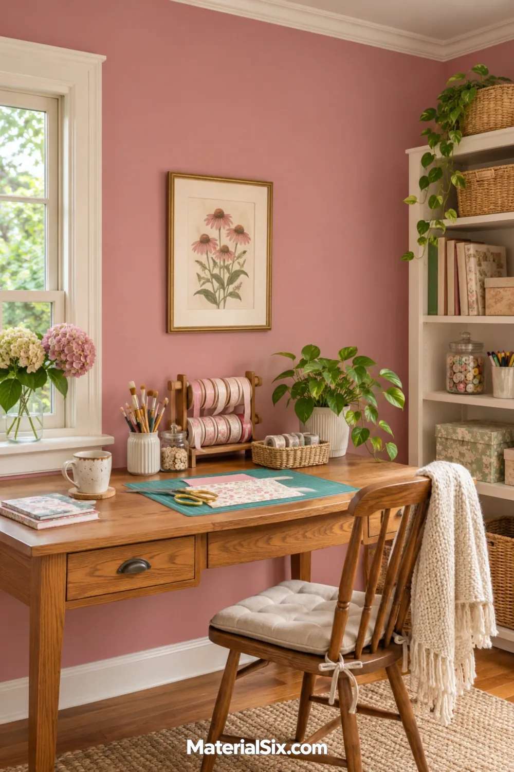
Dusty pink can sit comfortably next to an oak desk and off-white trim. Choose the direction of the pink with your largest wood piece in view. A clay-leaning pink feels warmer beside golden oak, while a grayer rose gives the grain more contrast.
7. Muted Lavender for a Shared Hobby Room
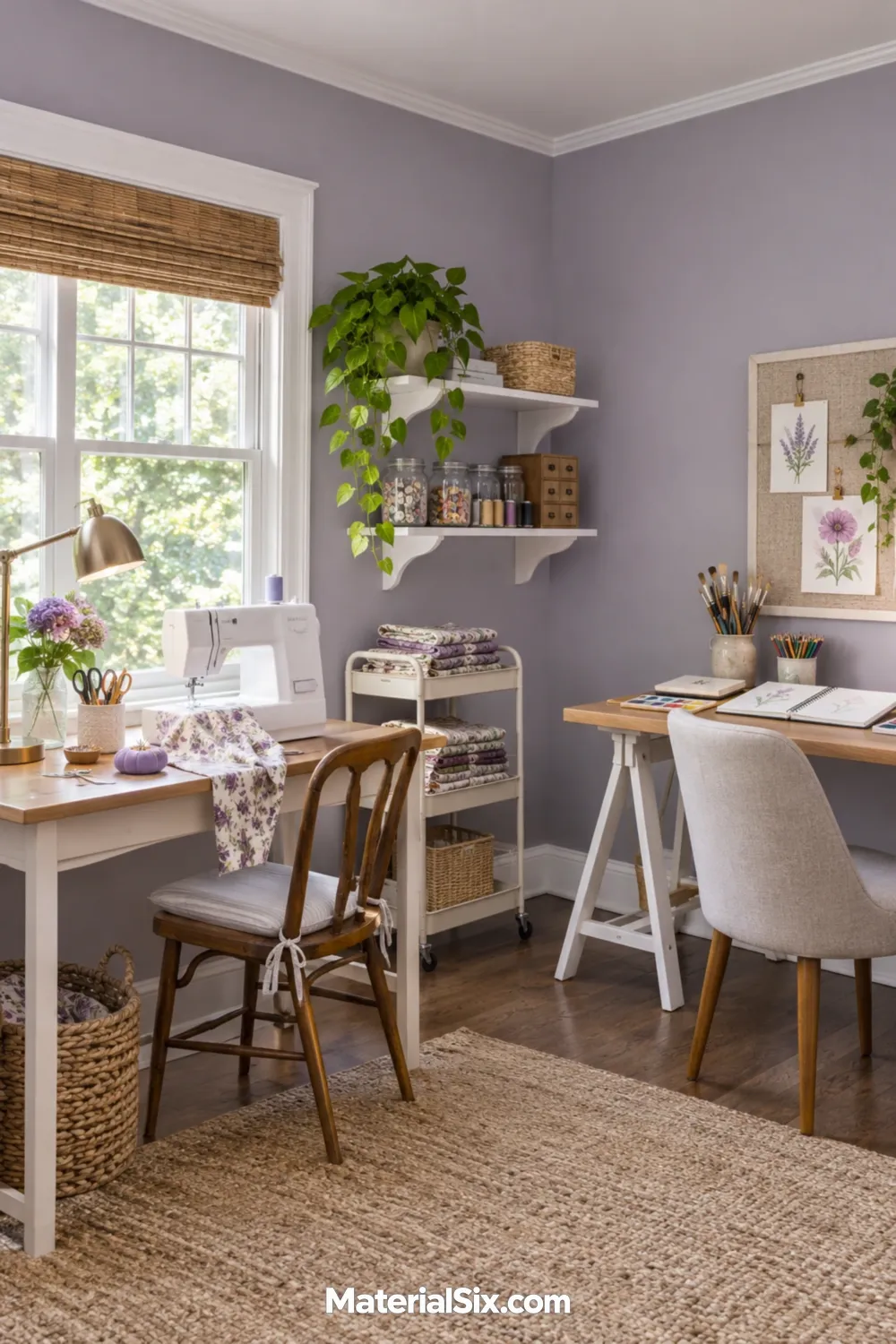
Give two workstations the same muted lavender walls and let the tools give each station its own character. It’s an option for a room that houses both a sewing machine and a drawing desk. Set a fabric you reach for often and a sheet of sketch paper next to the swatch. A version with a hint of gray gives both stations a softer backdrop.
8. Peach on the Wall Behind Your Worktable
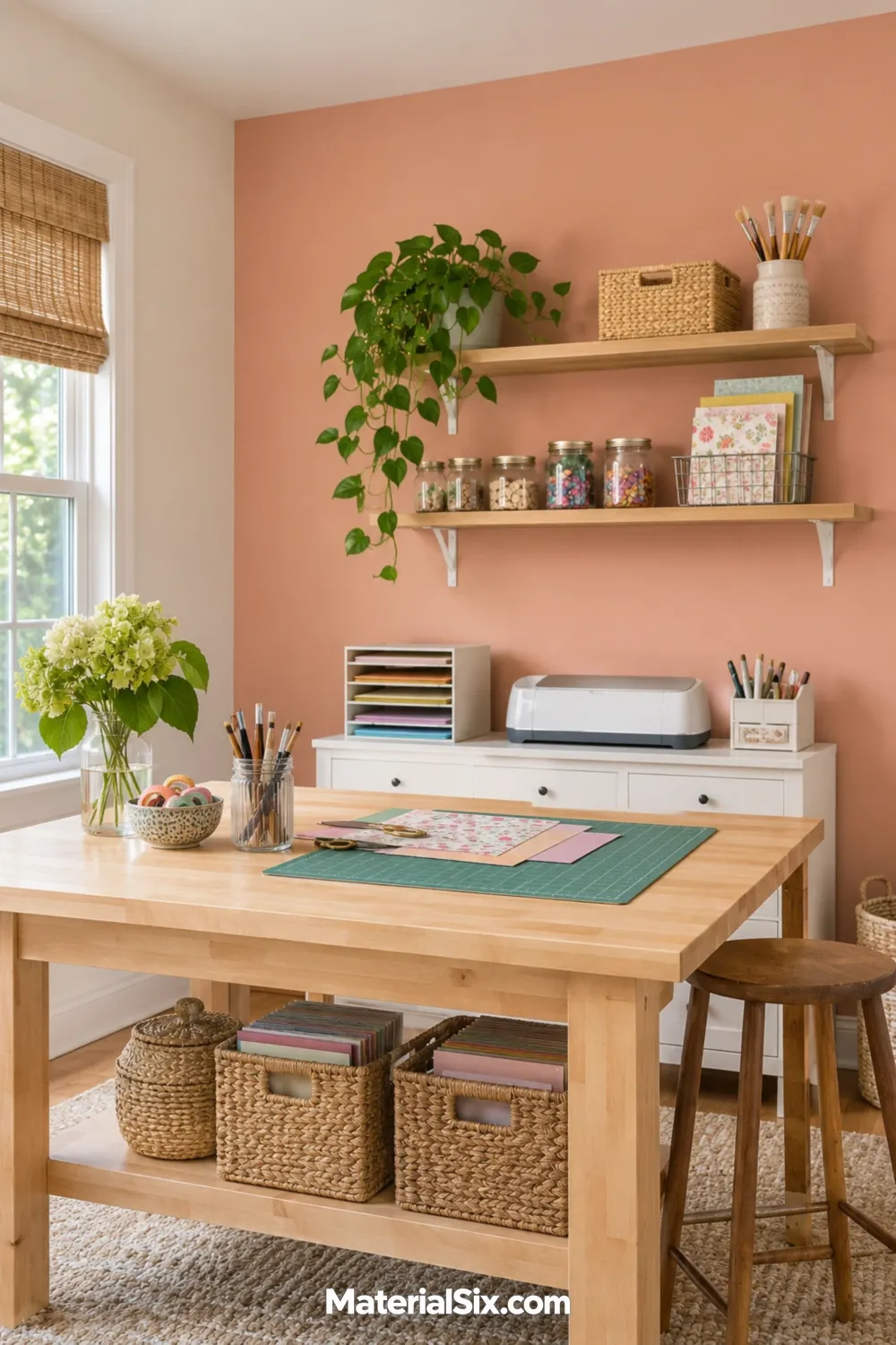
Use muted peach behind a freestanding craft table to give it a clear home in a multipurpose room. Stop the color at an inside corner and repeat the adjoining room’s trim color. When the table shifts for a bigger project, the painted wall still defines where the supplies and everyday setup belong.
9. Terracotta on the Lower Half of the Walls
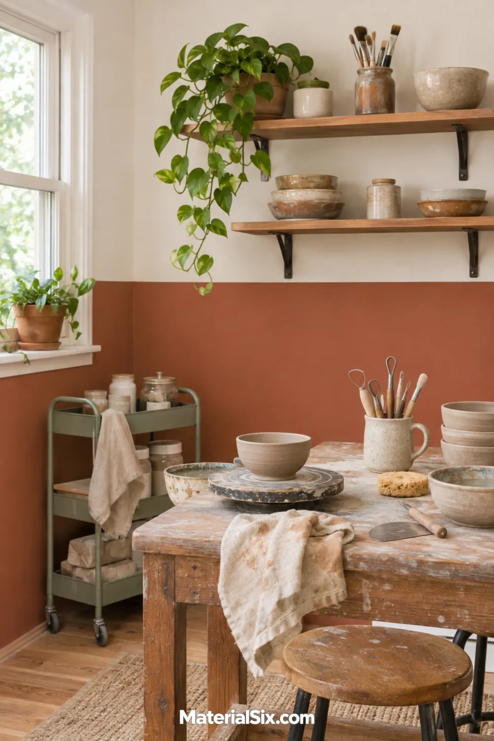
For an earthy pottery or mixed-media room, pair clay-toned terracotta below with creamy white above. Before picking the height of the paint break, stand in the doorway and check where the worktop and any low shelves land in your sightline. A stripe that clears the major furniture lines feels intentional.
Try a short test line with painter’s tape while you’re planning. On a heavily textured wall, you may prefer a narrow wood rail if getting an even edge becomes part of the job.
10. Deep Teal for a Built-In Supply Wall
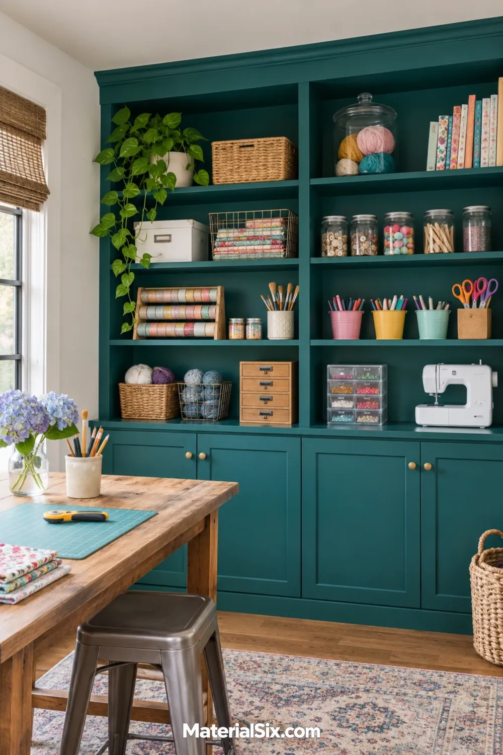
Paint the shelves, trim, and lower doors of a built-in the same deep teal. The repeated color makes the storage read as one piece of furniture and gives pale bins or clear jars a strong backdrop. Coat a sample board and lean it against the back of a shelf before deciding. A shade you love on an open wall may look darker under the shelf above it.
Check that your chosen paint is rated for the shelving or cabinet surface, including areas where bins will slide in and out.
11. Charcoal on a Pinup Wall
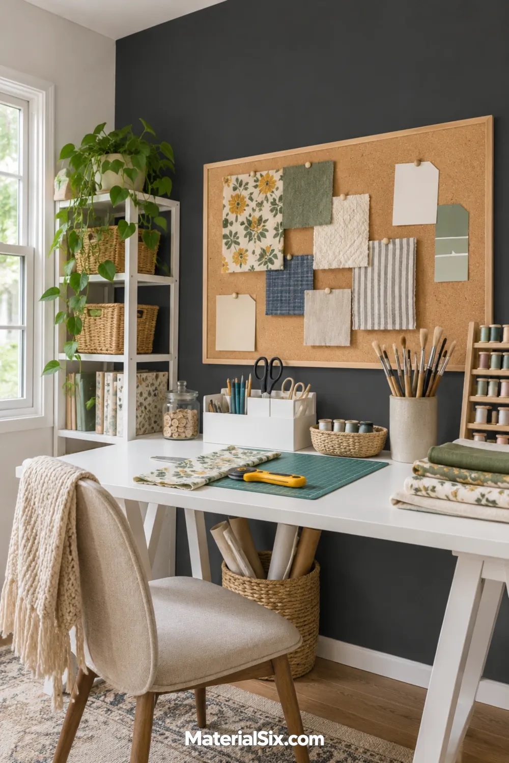
Use charcoal behind a big pinboard so cream paper, fabric samples, or white pattern pieces have a dark surround. A light desk below gives you a separate surface for assembly. This is a good place to try a dramatic color when you want to keep the main work surface visually quiet.
12. Olive Green for Painting and Plant Crafts
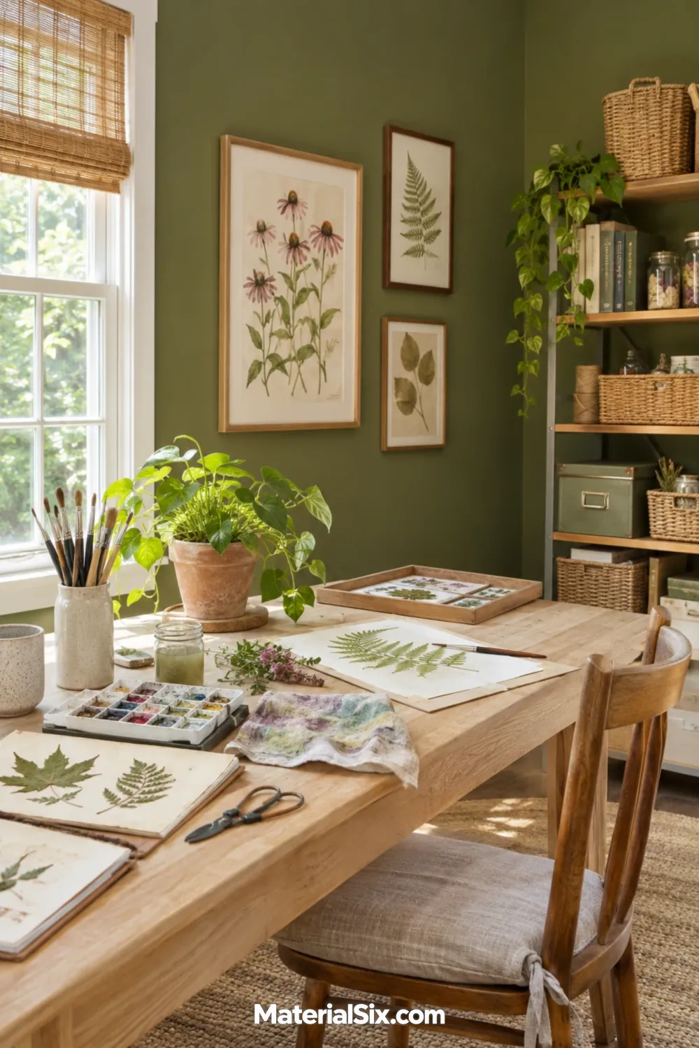
Earthy olive gives a botanical work area a strong color of its own. Pair it with pale timber and a light surface for mixing watercolors or arranging dried leaves. If you display cuttings or finished plant studies, leave a clear patch of wall around them so their shapes stay easy to see.
13. Color-Block Mural to Mark a Maker Zone
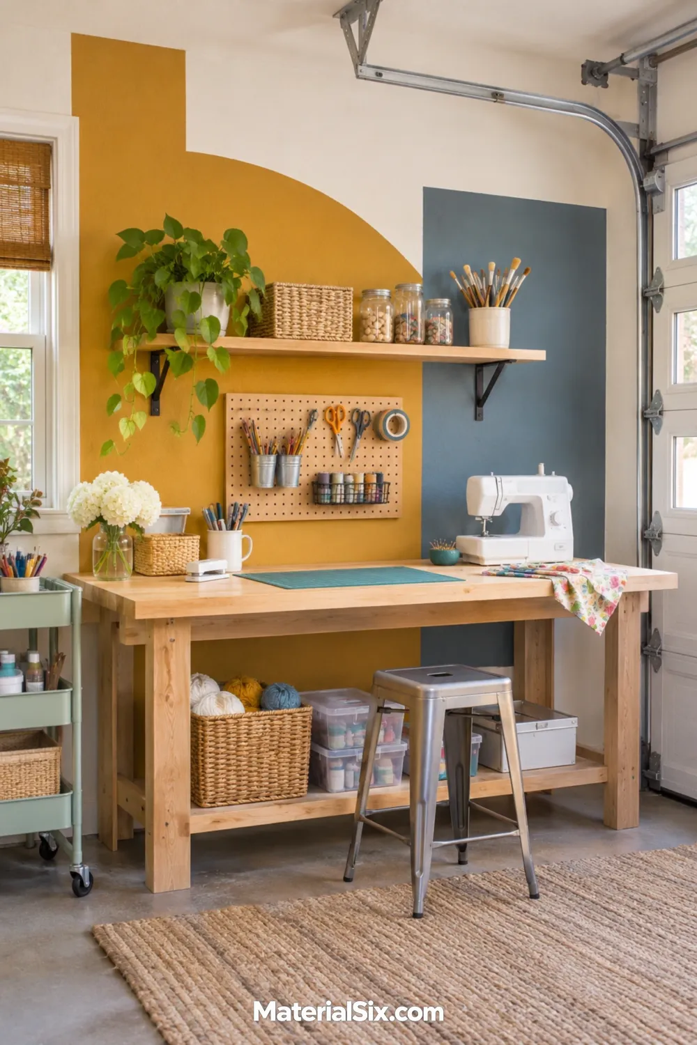
Use a few large blocks of ochre and muted blue to mark one workbench in a spare room or converted garage. A simple diagonal or stepped shape has enough scale to register from the doorway. Sketch the design with the furniture in place so the most interesting shapes stay visible above the bench.
Keep some of the original wall color around the mural. The margins give you a natural place to stop if the next part of the room serves a different purpose.
How to Test Paint Where You Actually Work
Paint portable sample boards and move them around the room. Check a wall that faces the window, the spot behind your chair, and the darkest shelf or corner.
- Bring project materials. Compare the samples next to white paper, your favorite fabrics, or the wood and clay you use most often.
- Switch on your work light. Check the color when you actually craft. If that’s after dinner, an evening test gives you more information than a midday glance.
- Look at the busiest view. Stand where you usually enter the room. If open storage adds plenty of color already, try your stronger paint on a smaller surface before giving it a full wall.
Pick the Surface Before the Shade
Decide which part of the room needs the color most. You can make the whole space feel more cohesive with painted walls, or give one work area a clear identity with a cabinet color, an accent wall, or a mural. Once you know the surface, compare your two favorite swatches there with the materials you’ll actually use.