
A dresser, cabinet, or chair can change the feeling of a room simply through the way its color is used. Maybe you want one strong shade, a little natural wood showing through, or a pattern that gives a familiar piece more personality. These painted furniture ideas offer 12 different directions, from small accents to expressive drawer fronts.
You will find options for bedroom storage, living room furniture, and display cabinets, with practical details to help you picture each look at home. Use the examples to choose your style direction before researching preparation and paint products for your particular furniture.
1. Give a Dresser One Confident Solid Color
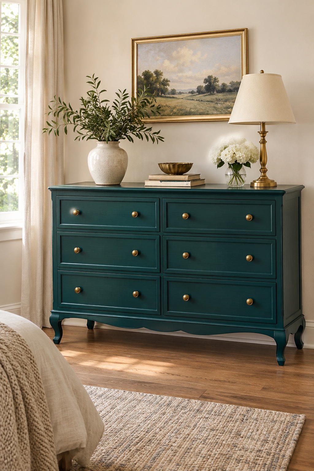
A deep teal dresser can anchor a bedroom without needing a complicated painted pattern. Keep the drawer fronts, frame, and feet the same color so the piece reads as one clear shape. This approach gives simple furniture a stronger presence and lets sculpted edges or curved legs stand out.
Try the color beside your bedding and wall paint before committing to the whole piece. Hardware makes a noticeable difference here: warm brass adds contrast, while matching painted knobs create a quieter look. Leave some space around the dresser and keep its top lightly styled so the finish stays the focus.
2. Pair Painted Drawers With a Natural Wood Top
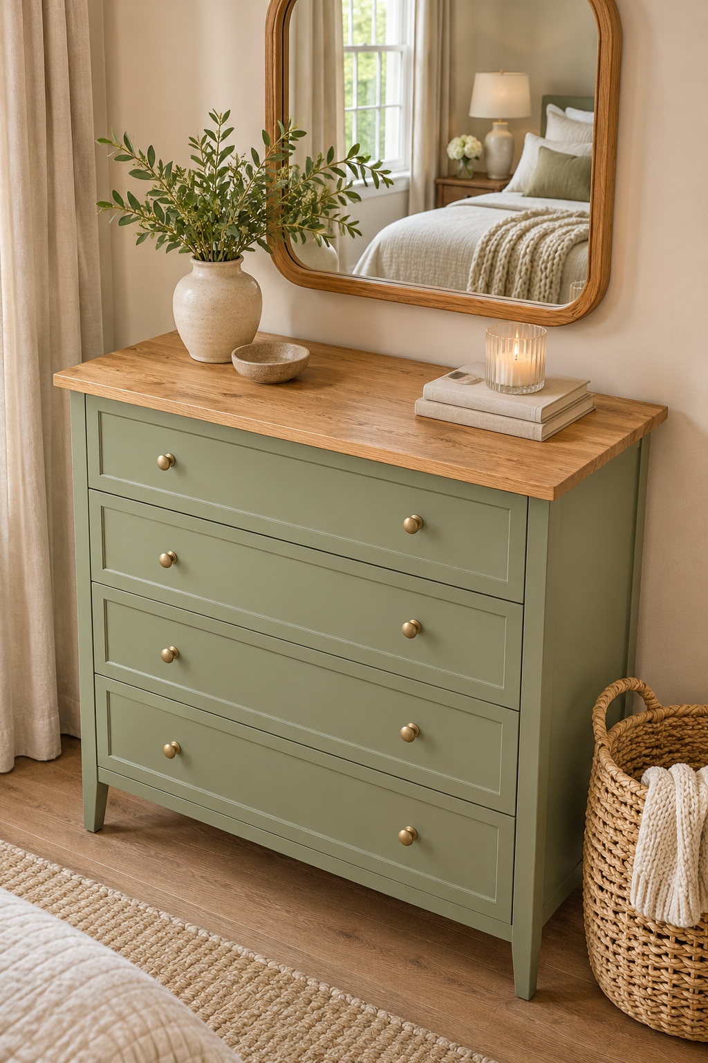
Keep a wood top visible when you want painted furniture to feel connected to the other wood finishes in a room. A sage green body paired with a warm wood surface gives a dresser two distinct textures without introducing a busy pattern. Choose a piece whose top is worth highlighting rather than assuming every surface needs the same treatment.
Repeat the wood tone in a mirror frame or nearby basket to help the combination feel settled. Before planning a refinishing project, identify whether the top is solid wood, veneer, or another material. That detail affects which preparation and finishing options are appropriate for your particular piece.
3. Use Color Blocking to Highlight a Cabinet’s Shape
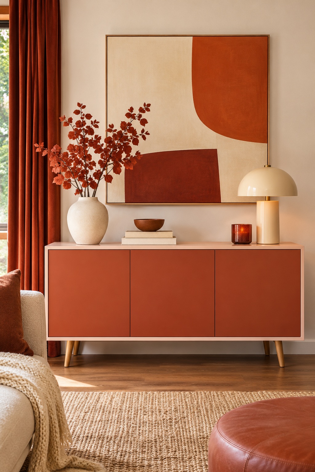
Color blocking works best when the boundaries follow an understandable part of the furniture. Paint the doors terracotta and keep the surrounding frame a pale blush, for example, so the construction gives the color changes a purpose. Broad blocks feel graphic without requiring a detailed illustration.
Sketch the front elevation first and decide where each color will begin and end. Keep the top and sides relatively simple if the doors already carry strong contrast. A restrained pair of colors also makes it easier to place the cabinet near artwork, patterned rugs, or upholstered furniture. Let one shade lead and use the other to outline its shape.
4. Fade Drawer Colors From Light to Dark
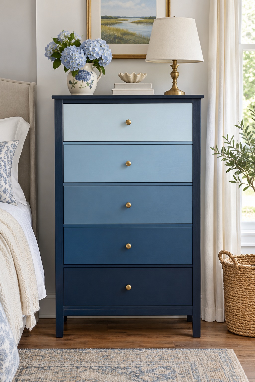
An ombré chest uses its drawer arrangement as the pattern. Start with a pale blue upper drawer and step through progressively deeper blues toward the bottom. Keeping the surrounding frame one steady color gives the gradual shift a clear boundary and prevents the whole piece from feeling visually scattered.
Line up color samples in the order they will appear before choosing the final combination. The change should remain visible between neighboring drawers, even in softer bedroom light. Use the same hardware throughout so the color progression gets the attention. This is especially useful inspiration for a tall chest with several similarly sized drawer fronts.
5. Paint a Botanical Motif Across Drawer Fronts
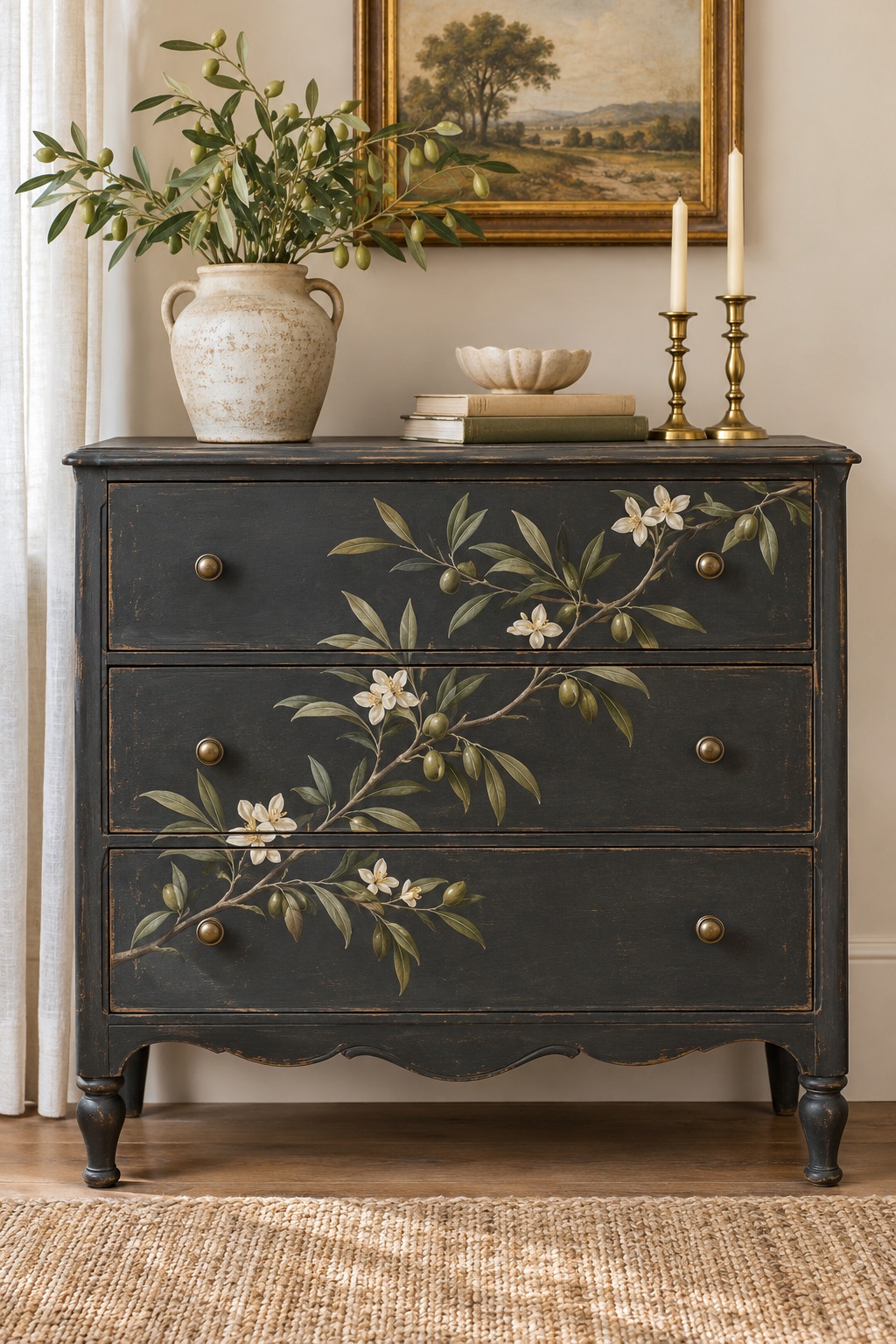
Treat the front of a dresser like a connected canvas with a leafy branch or loose floral design. A botanical motif can bridge several drawers, giving a plain silhouette a more personal character. Keep the background calm so stems and petals remain readable instead of competing with another strong pattern.
Plan the motif with the drawers closed, noting where the gaps interrupt leaves or flowers. Leave some open background around the edges to avoid a crowded result. A limited palette, such as olive leaves and ivory blossoms over charcoal, helps the design feel cohesive. Nearby accessories can pick up one small color rather than repeating the full pattern.
6. Add a Repeating Stenciled Pattern to Door Panels
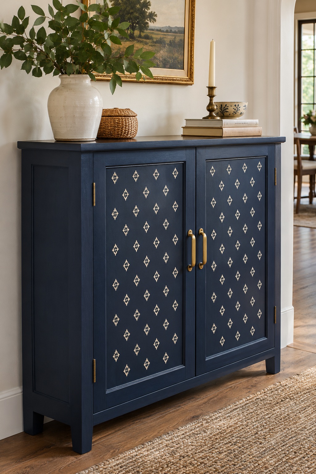
A repeating stencil brings rhythm to cabinet doors while leaving the frame uncluttered. Think of a small cream geometric pattern over navy panels, with the rails and sides painted in a solid coordinating shade. The contrast gives a flat front more visual interest and can echo shapes already present in a rug or curtain.
Work out the pattern placement on paper before settling on its size. Centering a repeat within each panel usually looks more deliberate than allowing a random partial shape to dominate one edge. Choose a motif with enough breathing room that it still reads from across the room, especially on a smaller cabinet.
7. Run Crisp Stripes Across a Bedside Table
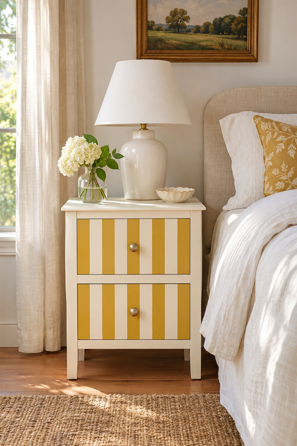
Stripes can give a small nightstand a lively identity without covering it in intricate decoration. Use cream and muted mustard across the drawer fronts, keeping their widths consistent. Let the frame stay solid so the striped area feels contained and the piece remains easy to pair with bedding.
Decide whether the pattern should continue across drawer gaps or restart on each front. Both can work, but planning the alignment avoids a disconnected appearance. A simple lamp and solid-color linens leave room for the pattern to stand out. If the room already contains stripes, change the scale so the furniture does not compete with every surrounding textile.
8. Try a Dipped-Leg Look on a Wood Table
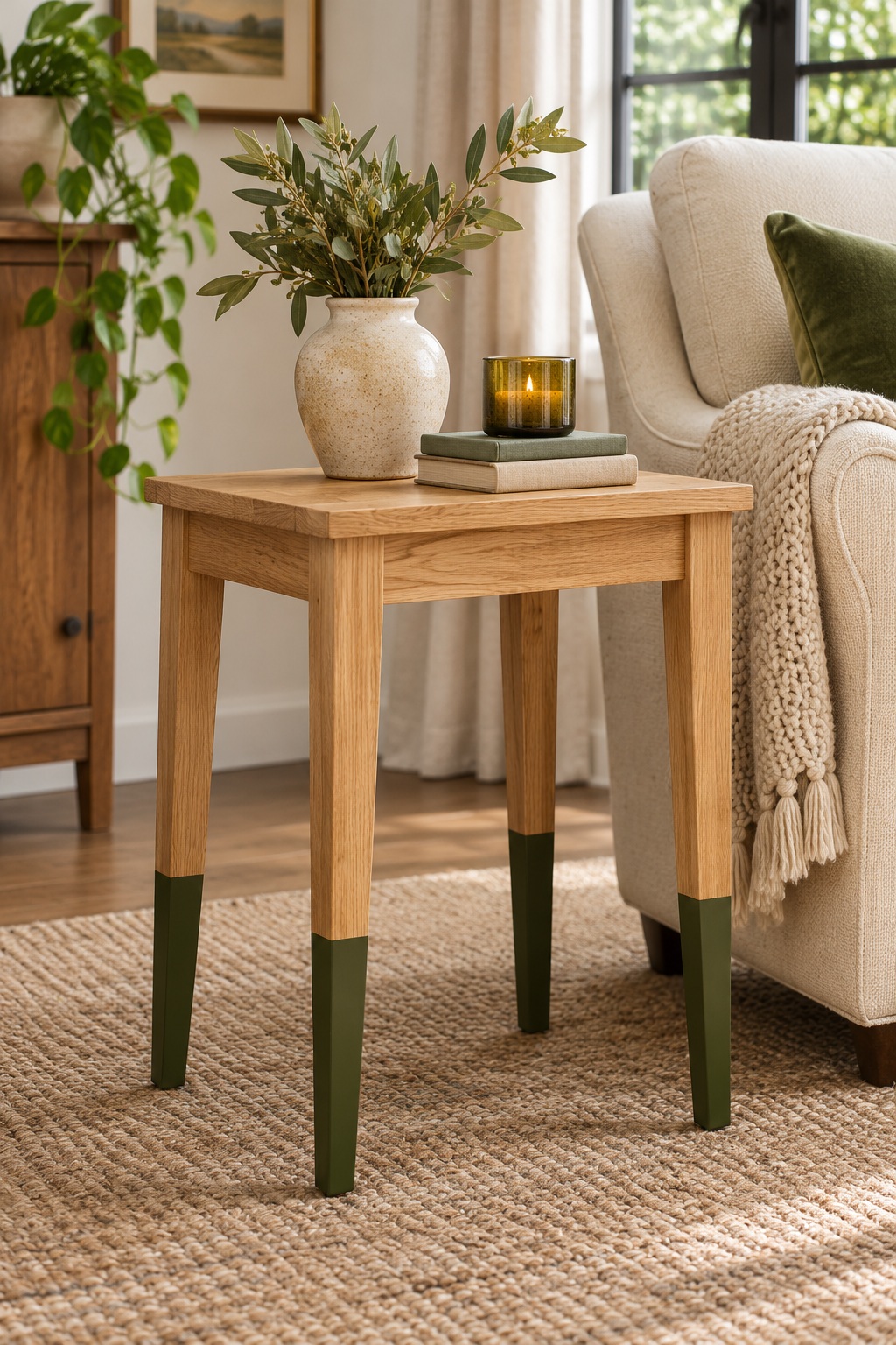
Painting only the lower portion of table legs creates a clear accent while leaving most of the wood visible. The result suits a simple side table or desk whose material is part of its appeal. A dark olive band near the feet adds definition without making the entire piece a strong block of color.
Mark the transition at the same height from the floor on each leg so the painted area looks intentional when the table stands upright. Consider how that line relates to stretchers or other structural details. Pair the table with a nearby painted accessory if you want the accent color to feel repeated throughout the room.
9. Give a China Cabinet a Contrasting Interior
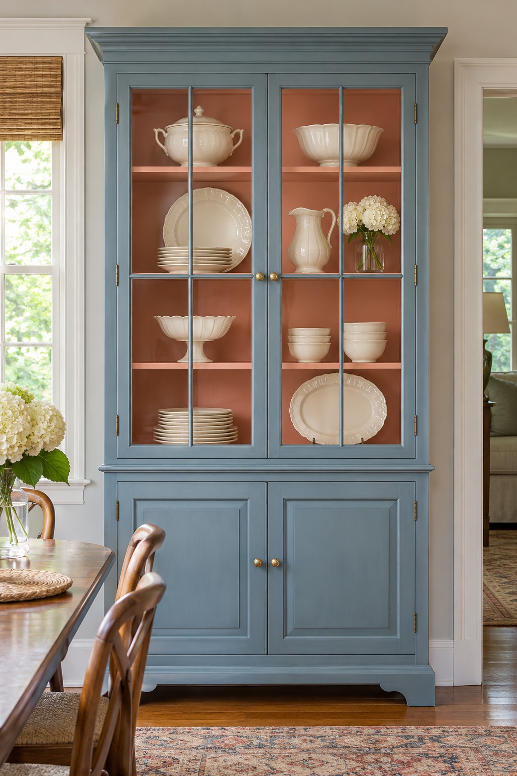
A contrasting interior makes a china cabinet feel layered even when its outer shape stays traditional. Try a muted blue exterior with a pale coral back panel, then display cream dishes against the warmer interior. The color difference draws attention through the glass and gives the contents a more defined backdrop.
Choose the interior shade alongside the objects you plan to keep inside. Clear glassware, patterned plates, and white pottery each interact differently with a colored background. Leave some shelf space open so the new finish remains visible. Keep the exterior hardware consistent to tie the upper display section and lower storage doors together.
10. Use Selective Distressing on a Vintage Piece
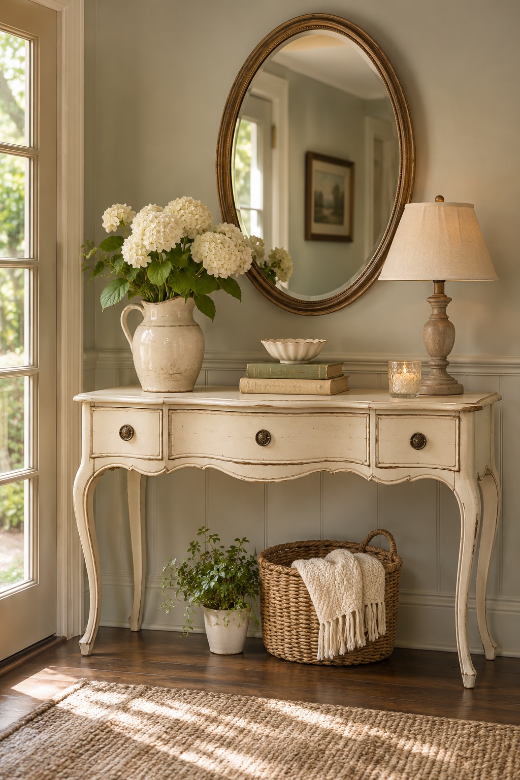
A lightly distressed finish can suit a vintage console with curved edges and visible shaping. Rather than scattering pale marks across every surface, concentrate the visual wear around edges, corners, and raised details. A muted cream finish with glimpses of darker material underneath lets the furniture’s form remain the main feature.
Decide whether the piece calls for a worn look before planning any work. Clean-lined contemporary furniture may suggest a different direction. If you are considering an older painted item, identify the existing finish and appropriate handling before sanding or disturbing it. This example is a style reference, not a preparation guide for unknown coatings.
11. Pick Out Raised Details With Metallic Paint
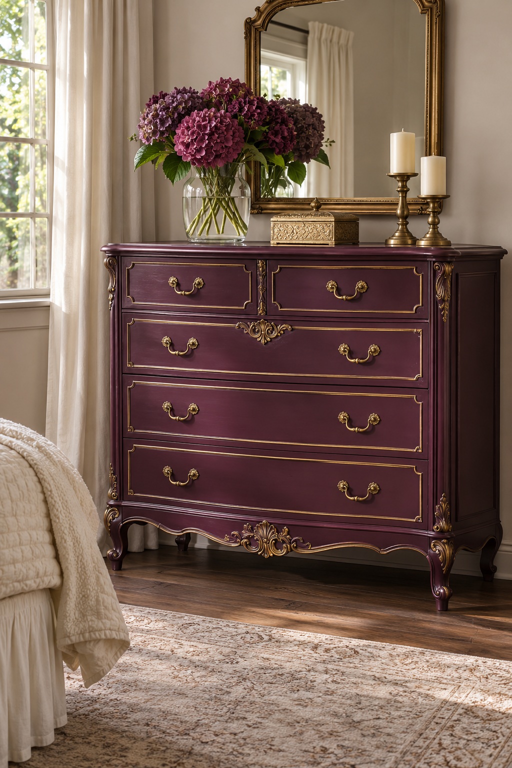
A small amount of metallic paint can emphasize carved details without taking over an entire dresser. A deep plum body with restrained gold accents on raised trim gives decorative furniture a more defined outline. Keep broad flat surfaces in the base color so the metallic touches remain a deliberate finishing detail.
Study the carving before choosing what to highlight. Repeating the accent on the same type of detail across each drawer usually feels more coherent than tracing every available edge. Plain hardware or a matching metal finish can support the combination. Use nearby textiles with quieter surfaces so the dresser’s mix of color and ornament has room to register.
12. Refresh a Chair Frame Around Its Upholstery
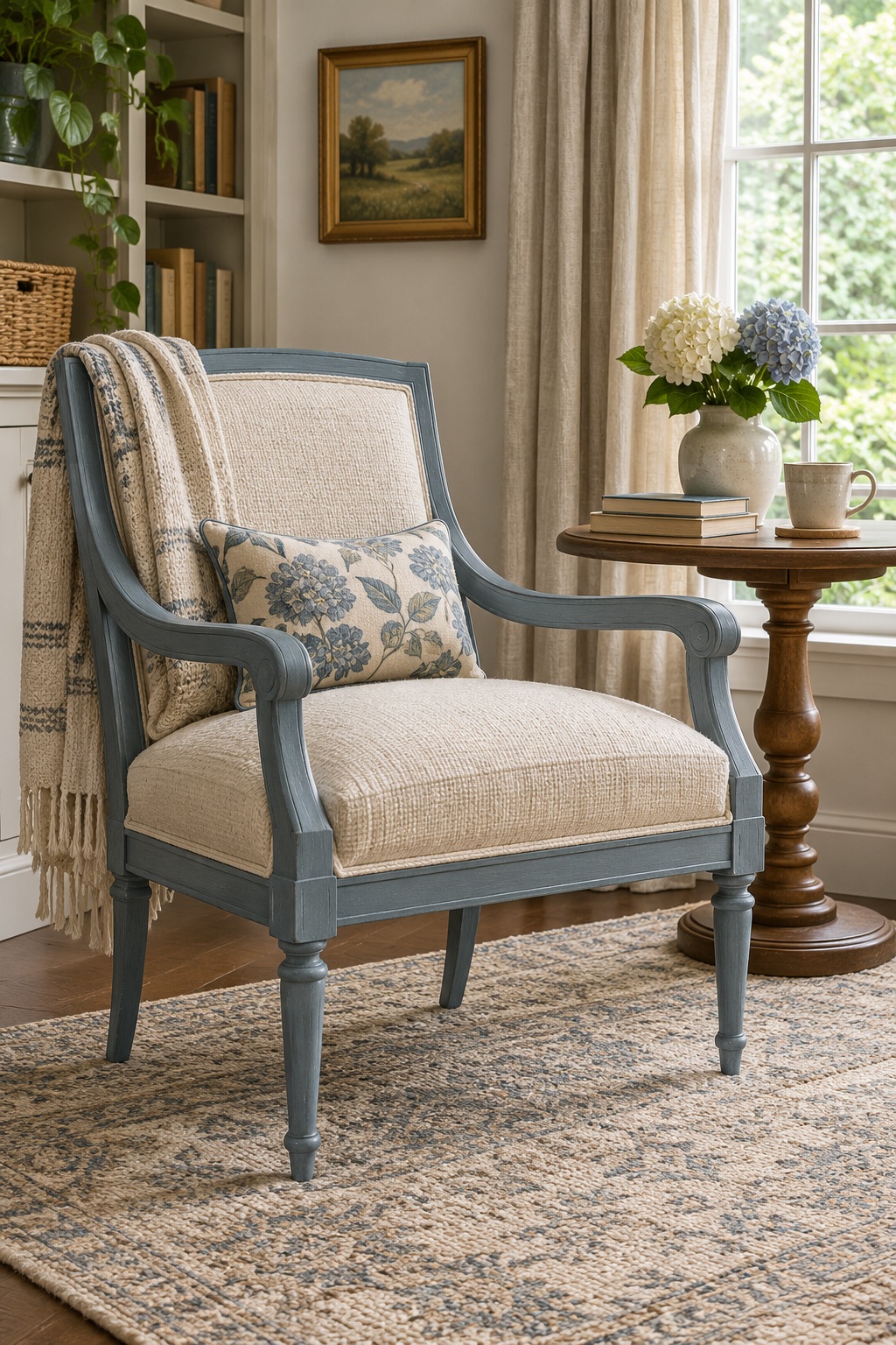
A painted chair frame lets you introduce color while keeping the upholstery as a separate visual element. A dusty blue wood frame around a cream woven seat can make a traditional chair feel lighter within a reading corner. The exposed rails, arms, and legs provide enough painted surface to establish the color without covering the fabric.
Choose the frame shade beside the existing upholstery and the room’s larger pieces. Look at the chair from the side as well as the front, since its arms and back may carry much of the color. Confirm which parts are wood and which finishes are suitable before treating this inspiration as a project plan.
Choose the Finish That Fits Your Piece
Start with the piece you already have and notice what deserves attention: its shape, wood grain, drawer arrangement, or decorative trim. Choose a painted finish that works with those features and the room around it. Save a few favorite examples, compare the colors in your own light, and build a project plan suited to your furniture’s material and existing finish.